I draw stories. – Page 23 of 41
I make comics, illustrations, self-publish books, and write about life, art and things of interest.

Sketch 265
February 20, 2020 | Miscellany
I wee ink sketch illustrating where our omni-present mobile phones come from. This is a very stupid drawing and you should not think otherwise. Bring, bring!

Sketch 264
February 19, 2020 | Miscellany
Ink sketch of our fearless astronaut on an alien world running back to her shuttle with a damaged robot orb. Probably. Make up your own story.

Sketch 263
February 16, 2020 | Miscellany
Ink sketch! The traveller knew the octopi had info about her missing sister. They had a reputation for being uncooperative. Good thing she brought a mediator.
Sketch 262
February 14, 2020 | Miscellany
Ink sketch! Detective Jake Thorn was roughed up, lied to, and wasn’t sure why this stray dog was following him, but he would solve this mystery or die trying.
Working In a New Ink Brush
February 13, 2020 | Miscellany
Work in progress of a new Robot and Francis comic, plus I’m breaking in a new ink brush and it’s giving me grief, but I like the results so that’s nice.
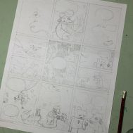
Robot Fixes the Engine Pencils
February 1, 2020 | Miscellany
Rough pencils for a new Robot and Francis comic wherein Robot is sent to fix a problem with the ship’s engine.
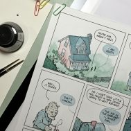
Watercolour Comic Work in Progress
December 23, 2019 | Miscellany
A quick peek at a couple panels from a work in progress comic featuring Death, plus a handy tip on fixing minor ink mistakes. You’re welcome!
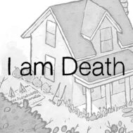
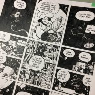
I Am Death
December 22, 2019 | Comics
In this comic, Death gets some new clothes, and meets an old man who is a critic right to his last breath.
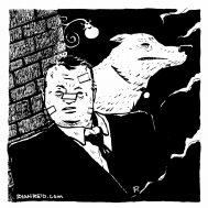
Emotional Baggage
December 19, 2019 | Miscellany
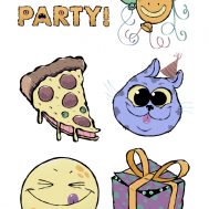
Weird birthday party postcard
December 2, 2019 | Miscellany